Introduction

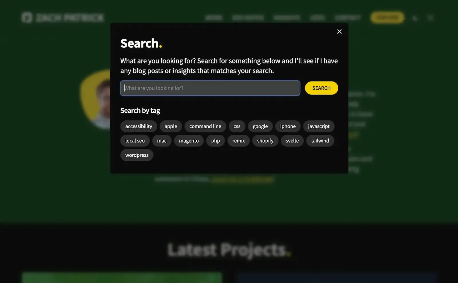
Modals are one of the more common components you'll see on the internet. They're used for things likes image lightboxes, website search forms, mobile menus, and more.

There's surprisingly a lot that can go into a simple modal so building a reusable component is a great way of taking care of some of the basic functionality.

Functionality

We can add some of the basic functionality like trapping focus inside the modal and allowing users to close the modal by pressing escape inside the <script> tags.

scripts

<script>
  import { fade, fly } from 'svelte/transition';
  import { trapFocus } from '$lib/trapFocus'; // https://zachpatrick.com/blog/how-to-trap-focus-inside-modal-to-make-it-ada-compliant
 
  /* trap all keyboard navigation inside the modal */
  function initTrapFocus(e) {
    return trapFocus(e, `modal`);
  }

  /* close the modal when the escape button is pressed */
  function closeWithEscape(e) {
    if (e.keyCode === 27) {
      isOpen = false;
    }
  }

  export let isOpen = false;
</script>

<!-- add keyboard event listeners to window while modal is open -->
<svelte:window on:keydown={initTrapFocus} on:keyup={closeWithEscape} />

The HTML

Next, we can add the modal html, including an overlay and some nice Svelte transitions.

the html

<div
  role="dialog"
  id="modal"
  class="fixed inset-0 z-50 flex items-start justify-center overflow-auto overscroll-contain"
  class:window-noscroll={isOpen}
>
  <div
    id="modal-overlay"
    class="fixed inset-0 z-10 bg-black/50"
    aria-hidden="true"
    on:click={() => (isOpen = false)}
    transition:fade={{ duration: 100 }}
  ></div>

  <div class="relative z-20" transition:fly={{ y: -60, duration: 250 }}>
    <slot />
  </div>
</div>

Basic Styling

Now we can add some very basic styling. The most important piece we'll add is overflow: hidden; to the html and body element when the modal is opened. We added an optional class of window-scroll when the modal is open with the following, class:window-noscroll={isOpen}. Anytime a modal has the window-noscroll class we’ll make sure the html and body elements overflow is hidden.

modal styles

<style>
  :global(html:has(.window-noscroll), html:has(.window-noscroll) body) {
    overflow: hidden;
  }

  :global(header.site-header),
  :global(#main) {
    transition: filter 500ms;
  }

  :global(html:has(.window-noscroll) header.site-header),
  :global(html:has(.window-noscroll) #main) {
    filter: blur(5px);
  }
</style>

Using the Component

Now that we have our modal component we can use it anytime we want to add a modal to our website.

svelte

<script>
  import Modal from '$components/Modal.svelte';

  let isCoolModalOpen = false;
</script>

<Modal bind:isOpen={isCoolModalOpen}>
  I'm inside of a cool new modal! 😄
</Modal>

Full Modal Component

Modal.svelte

<script>
  import { fade, fly } from 'svelte/transition';
  import { trapFocus } from '$lib/trapFocus'; // https://zachpatrick.com/blog/how-to-trap-focus-inside-modal-to-make-it-ada-compliant
 
  /* trap all keyboard navigation inside the modal */
  function initTrapFocus(e) {
    return trapFocus(e, `modal`);
  }

  /* close the modal when the escape button is pressed */
  function closeWithEscape(e) {
    if (e.keyCode === 27) {
      isOpen = false;
    }
  }

  export let isOpen = false;
</script>

<!-- add keyboard event listeners to window while modal is open -->
<svelte:window on:keydown={initTrapFocus} on:keyup={closeWithEscape} />

<div
  role="dialog"
  id="modal"
  class="fixed inset-0 z-50 flex items-start justify-center overflow-auto overscroll-contain"
  class:window-noscroll={isOpen}
>
  <div
    id="modal-overlay"
    class="fixed inset-0 z-10 bg-black/50"
    aria-hidden="true"
    on:click={() => (isOpen = false)}
    transition:fade={{ duration: 100 }}
  ></div>

  <div class="relative z-20" transition:fly={{ y: -60, duration: 250 }}>
    <slot />
  </div>
</div>

<style>
  :global(html:has(.window-noscroll), html:has(.window-noscroll) body) {
    overflow: hidden;
  }

  :global(header.site-header),
  :global(#main) {
    transition: filter 500ms;
  }

  :global(html:has(.window-noscroll) header.site-header),
  :global(html:has(.window-noscroll) #main) {
    filter: blur(5px);
  }
</style>