This post goes over why and how to use heading levels appropriately. I'll also discuss what to do when the design doesn't include headings for different sections.
What are heading tags?
Headings tags (H1-H6) are used to build the structure of your page. This helps search engines understand what your page is about. Headings are also extremely important for those that navigate the internet using screen readers. Headings allow screen reader users to quickly scan the page to figure out what the page is about. It also helps them jump from section to section without getting lost.
Appropriate usage
When you add a new heading to your page (H2, H3, etc.). It's important to make sure you're adding these in sequential order. You should never add an H3, if you haven't already added an H2. Also, you shouldn't skip H3 and add an H4 or H5. Headings should never be used solely for the purpose of making text bigger or smaller.
For example, let's say you're writing a new blog post about the different food groups. The title (H1) might be something like, Know Your Food Groups.
It's important to note that every webpage should have one H1.
In your post, you might want to write a section about fruits. To start this section you would add a new H2 with the text of Fruits.
Then let's say you want to talk specifically about apples. You would start a new section using an H3 with the text of Apples, since apples is a type of fruit.
Now maybe you want to write a section about your favorite types of apples. Because you're still talking about apples, you would start a new section using an H4 with the text of My Favorite Apples.
Now you want to write a section on grapes so you will add an H3 with the text of Grapes to start a new subsection of the Fruits (H2) section.
Okay you've finished talking about fruits and you want to move on to talking about vegetables. Just like you did with fruits, you would create a new section using an H2 with the text of Vegetables. And follow the same pattern as you did with fruits when you want to talk about different types of vegetables.
example heading structure
Should all sections have headings?
It's a good idea to give all sections a heading that describes the section, even if a heading isn't in the design. That doesn't mean that you have to add a heading to the design, however.
For example, let's say you have the following footer.
.webp)
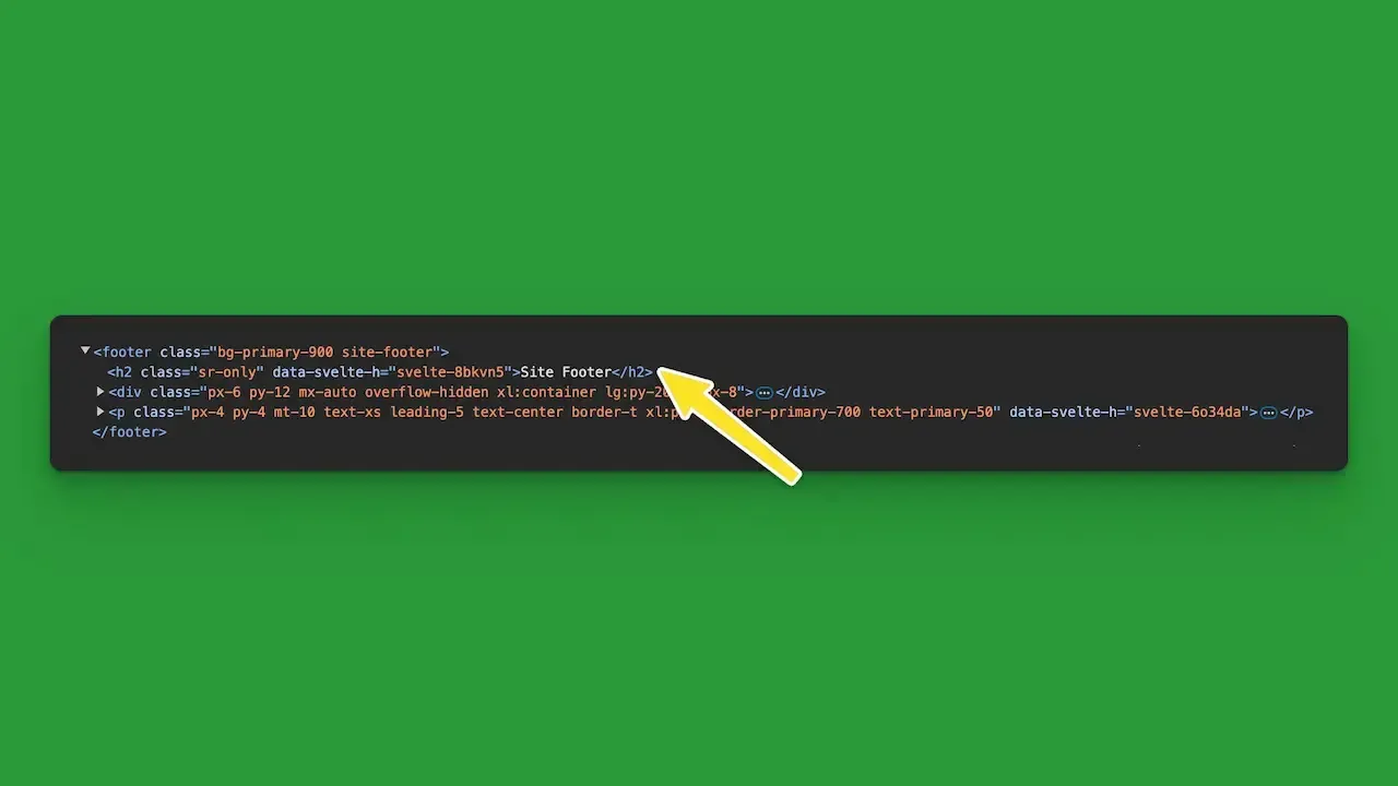
Looking at it, it appears that there is not a section header describing the footer. However, when you take a closer look you see that the footer actually does have a header. The header is there, but it's visually hidden on the page.

Doing this will make it easier for search engines and screen readers to understand what's going on on the page. Just make sure that you are only hiding the headings visually.
What if I don't add headings to all sections?
If you neglect to give every main section on the page a heading, then the content in that section will appear to search engines and screen readers to belong to the most recent section that does have a header.
Let's take a look at the example heading structure above where we talked about fruits and vegetables. Maybe we own a farmer's market and people have left reviews about our fruits and vegetables, and we want to have a reviews section at the bottom of the page.
We only want this reviews section to display reviews. We don't want it to show a title or any other text. Since this section is immediately following the section about vegetables, all the reviews will appear to be associated with Broccoli, since that was the last subsection under vegetables.
poor heading structure
Why is Jared saying he loves apples when we're talking about broccoli? And Tony, I love that you picked up some blueberries, but we're still talking about broccoli... As you can see in this example, neglecting to add a section header can create confusion for those viewing our page any other way but visually. We can avoid this confusion by simply adding an H2 and hiding it from the page visually.
good heading structure
Now we can clearly tell that Jared and Tony have left reviews about our fruits and vegetables, and not specifically broccoli.
Final Thoughts
When building websites, please keep in mind the importance of using headings appropriately.
Headings are the table of contents for your page. They help describe what the page is about and help people jump from section to section.
Headings should always be added in sequential order. Adding them out of order damages the structure of the page and can make for a worse user experience. Imagine the table of contents of the next book you read skipped from chapter 1 to chapter 5 and then back to chapter 3. That would be pretty infuriating.
You should never use a heading just because you like the way the text looks. If you want to make the text look a certain way you should be doing so using CSS.
Make sure to add headings wherever they make since, even if they won't be showing up on the page visually. It's important to make sure your website is accessible to anyone that may want to view it.
